library(tidyverse)
#for plotting
library(ggbump)
library(ggimage)
library(ggtext)
#for data wrangling
library(tidyr)
library(glue)Intro
Bump charts are a nice way to look at change in rankings over time. For this year’s #30DayChartChallenge, I created a bump chart comparing switch ups in rankings for clubs participating in the English Premier League.
Side note, sometimes figuring out the topic for a viz can be tricky. Luckily, I had a lot of inspiration from the #TIdyTuesday community posting visuals for the EPL this week, plus I was feeling major Ted Lasso vibes from watching the latest season (Go Richmond!).

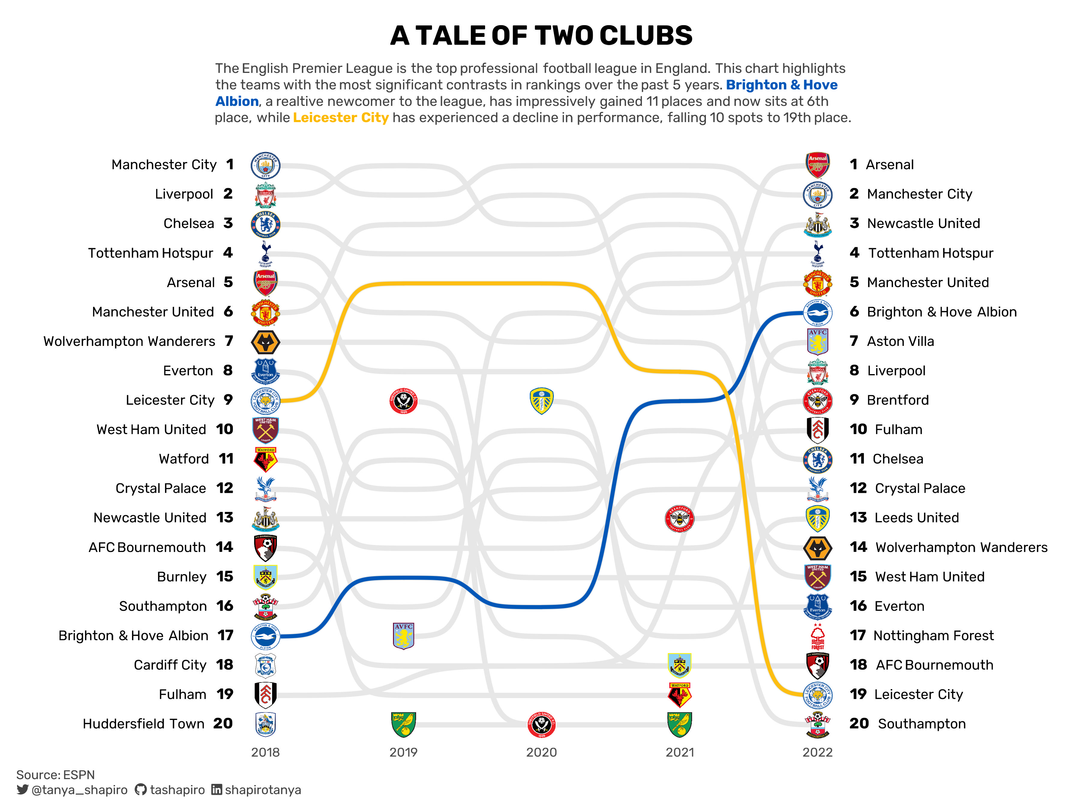
Today we’ll look at a play-by-play of how to create a similar ggplot bump chart like the original one I created below:
Library Set Up
Let’s get started by importing our libraries. For this data viz, our main stars are ggplot2 and ggbump, an ggplot extension library. We’ll also need ggimage to plot logo images and ggtext to spruce up our text labels with some HTML tricks.
Import & Preview Data
Then we’ll import our data sets. We’ll be working with two sets of data to create our visual: df_team_season and ref_teams. The former includes data per team and season, while the latter includes reference information for each team.
Note on data: I scraped ESPN’s EPL page to create df_team_season. I also grabbed JSON data from EPL’s site to get reference data and images for all teams who’ve competed in the past.
library(kableExtra)
#import data
df_team_season<-read.csv("data/epl_team_season.csv")
ref_teams<-read.csv("data/ref_epl_teams.csv")

kable(head(df_team_season,5))| rank | team_name | team_abbr | GP | W | D | L | F | A | GD | P | season |
|---|---|---|---|---|---|---|---|---|---|---|---|
| 1 | Manchester City | MNC | 38 | 32 | 2 | 4 | 95 | 23 | 72 | 98 | 2018 |
| 2 | Liverpool | LIV | 38 | 30 | 7 | 1 | 89 | 22 | 67 | 97 | 2018 |
| 3 | Chelsea | CHE | 38 | 21 | 9 | 8 | 63 | 39 | 24 | 72 | 2018 |
| 4 | Tottenham Hotspur | TOT | 38 | 23 | 2 | 13 | 67 | 39 | 28 | 71 | 2018 |
| 5 | Arsenal | ARS | 38 | 21 | 7 | 10 | 73 | 51 | 22 | 70 | 2018 |
Here’s a preview for ref_teams:
kable(head(ref_teams,5))| id | abbr | name | short_name | logo |
|---|---|---|---|---|
| 127 | BOU | Bournemouth | Bournemouth | https://resources.premierleague.com/premierleague/badges/t91.png |
| 1 | ARS | Arsenal | Arsenal | https://resources.premierleague.com/premierleague/badges/t3.png |
| 2 | AVL | Aston Villa | Aston Villa | https://resources.premierleague.com/premierleague/badges/t7.png |
| 30 | BAR | Barnsley | Barnsley | https://resources.premierleague.com/premierleague/badges/t37.png |
| 35 | BIR | Birmingham City | Birmingham | https://resources.premierleague.com/premierleague/badges/t41.png |
Data Exploration
Before we start visualizing our data, we’ll need to do some quick exploration. What story do we want to tell?
First, let’s take a look at some summary level details at the team level. What was each team’s first season in this period of time? Where did they initially rank, and where are they ranked now?
team_summary<-df_team_season|>
  select(rank, team_abbr, team_name, season)|>
  group_by(team_abbr, team_name)|>
  summarise(first_season = min(season),
         last_season = max(season),
         first_rank = rank[season==first_season],
         last_rank = rank[season==last_season])|>
  mutate(delta= first_rank-last_rank)|>
  ungroup(team_abbr)|>
  arrange(delta)

kable(head(team_summary,5))| team_abbr | team_name | first_season | last_season | first_rank | last_rank | delta |
|---|---|---|---|---|---|---|
| SHU | Sheffield United | 2019 | 2020 | 9 | 20 | -11 |
| LEI | Leicester City | 2018 | 2022 | 9 | 19 | -10 |
| CHE | Chelsea | 2018 | 2022 | 3 | 11 | -8 |
| EVE | Everton | 2018 | 2022 | 8 | 16 | -8 |
| WAT | Watford | 2018 | 2021 | 11 | 19 | -8 |
From the table above, we notice that Sheffield United had the biggest drop off in rank, from 9th to 20th place. Their final season in this data set is marked at 2020 (they were relegated from the Premier League the following season) - meaning we only have two observations.
Leicester City on the other hand has played in all five seasons and has an equally alarming drop-off. This might be interesting to highlight.
What about most improved teams?
kable(head(team_summary|>arrange(desc(delta)),5))| team_abbr | team_name | first_season | last_season | first_rank | last_rank | delta |
|---|---|---|---|---|---|---|
| BHA | Brighton & Hove Albion | 2018 | 2022 | 17 | 6 | 11 |
| AVL | Aston Villa | 2019 | 2022 | 17 | 7 | 10 |
| NEW | Newcastle United | 2018 | 2022 | 13 | 3 | 10 |
| FUL | Fulham | 2018 | 2022 | 19 | 10 | 9 |
| ARS | Arsenal | 2018 | 2022 | 5 | 1 | 4 |
Brighton & Hove Albion appear to be superstars are on the rise. They’ve climbed from 11th place to 6th place during the same time span. This will be a nice complementary story to Leicester City’s decline.
Data Pre-Processing
Bump Data
Now that we’ve found our story, let’s clean up our data. For ggbump, we need a minimum of two observations (or here, two seasons), so let’s filter our df_team_season data with dplyr to omit teams who only appeared in one season.
Additionally, we want to highlight the stars of our story - Brighton & Hove Albion and Leicester City. To do this, we’ll assign unique colors to both teams (in this case, team colors are appropriate), and we’ll tone down the other teams with a drab grey.
bump_data<-df_team_season|>
  #bump needs at least 2 observations, remove teams with only one season
  group_by(team_name)|>
  mutate(seasons=n())|>
  filter(seasons>1)|>
  #create colors for lines, accent Brighton & Leicester, everything else grey!
  mutate(color = case_when(team_name=="Brighton & Hove Albion" ~ '#0057B8',
                           team_name== "Leicester City" ~ '#FDBE11',
                           TRUE ~ "#E7E7E7"))
Let’s get a quick preview what a basic plot would look like. Notice some of the grey teams overlap and send our highlighted teams to the background?
ggplot(data=bump_data)+
  ggbump::geom_bump(mapping=aes(x=season,y=rank, group=team_name, color=I(color)))+
  theme_minimal()+
  theme(panel.grid=element_blank())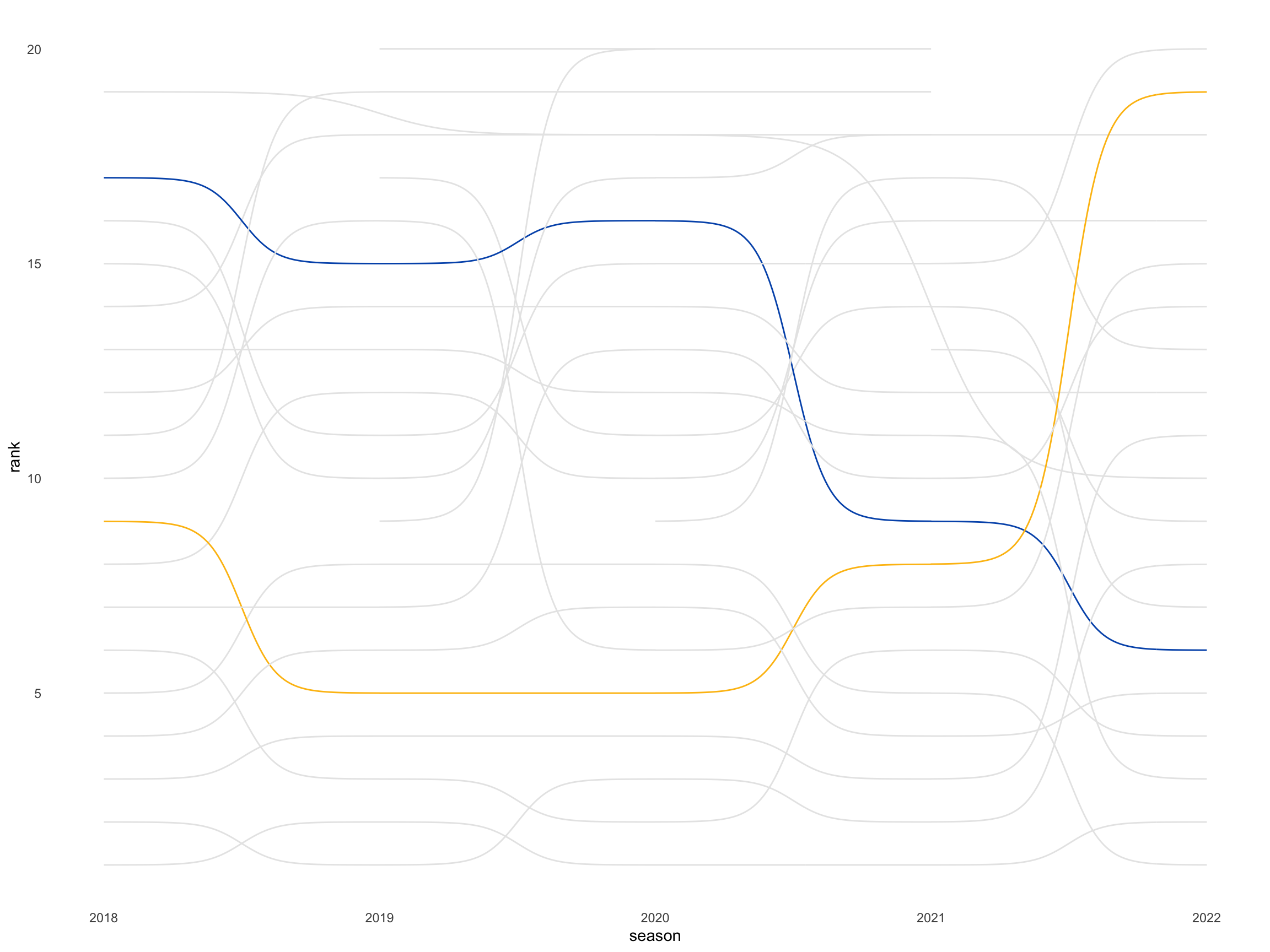
To solve for this we’ll need to convert team to a factor variable to reorder the z-index positions of our teams.
#create factor for teams to reorder z-index
other_teams<-ref_teams$name[!ref_teams$name %in% c("Brighton & Hove Albion","Leicester City")]
#convert bump data to factor with levels
bump_data$team_name<-factor(bump_data$team_name, levels=c(other_teams,"Brighton & Hove Albion", 'Leicester City'))
Let’s take a look at the plotting behavior now:
ggplot(data=bump_data)+
  ggbump::geom_bump(mapping=aes(x=season,y=rank, group=team_name, color=I(color)))+
  theme_minimal()+
  theme(panel.grid=element_blank())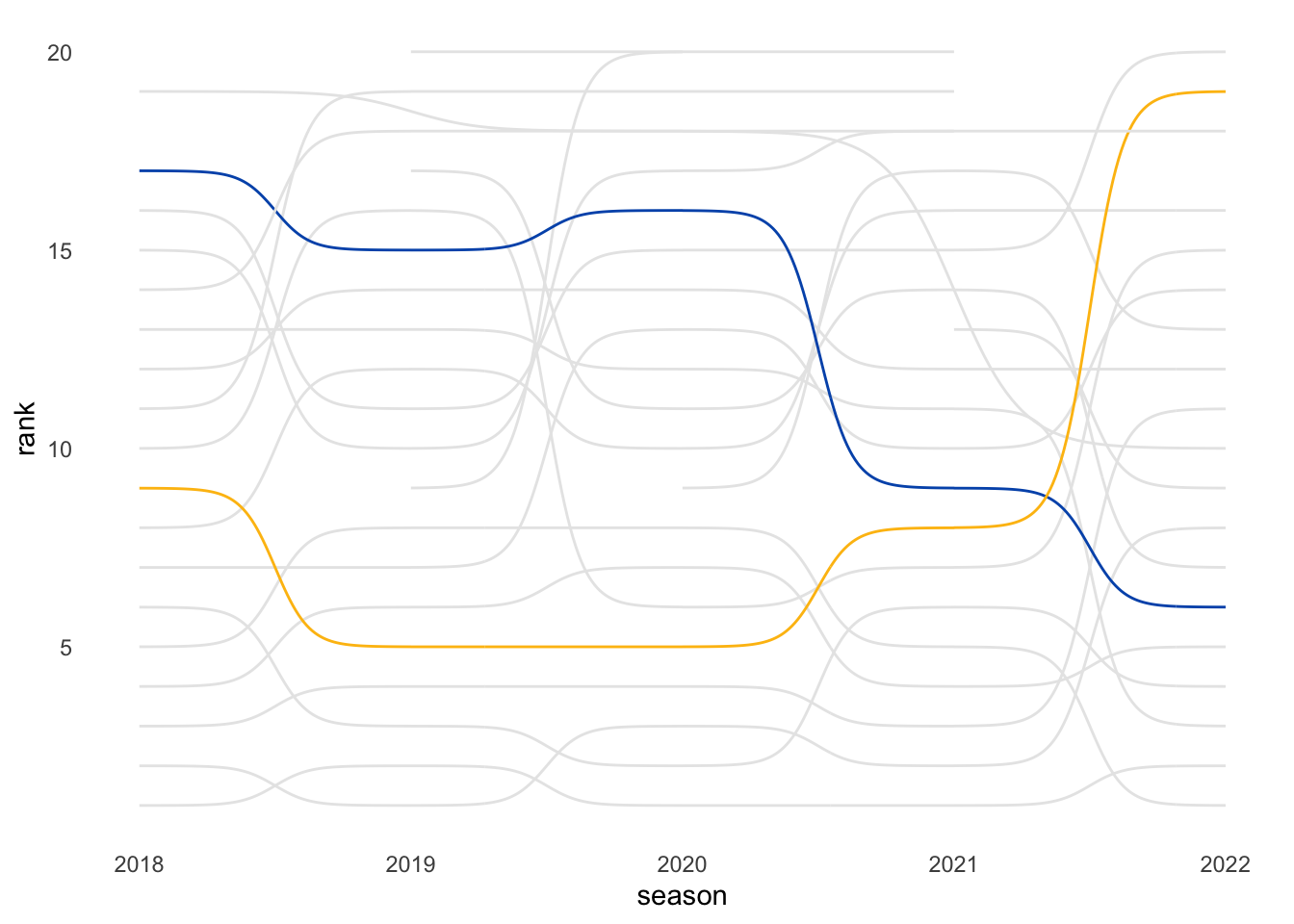
Image Data
We want to include the logo images for each team to show their starting and end points. This is where the ref_teams data set comes in: to reshape our data, we’ll append the logo values to our team_summary aggregation with dplyr::left_join.
image_data <- team_summary%>%
  left_join(ref_teams|>select(abbr,logo), by=c("team_abbr"="abbr"))
Quick check to see if any of the logos are missing:
image_data|>
  filter(is.na(logo))|>
kable()| team_abbr | team_name | first_season | last_season | first_rank | last_rank | delta | logo |
|---|---|---|---|---|---|---|---|
| MNC | Manchester City | 2018 | 2022 | 1 | 2 | -1 | NA |
| MAN | Manchester United | 2018 | 2022 | 6 | 4 | 2 | NA |
Aha, two of our teams are missing logos. Seems like ESPN’s abbreviations and the EPL’s team abbreviations don’t perfectly line up. We’ll fill them in manually here.
image_data$logo[image_data$team_name=="Manchester City"] = ref_teams$logo[ref_teams$name=="Manchester City"]
image_data$logo[image_data$team_name=="Manchester United"] = ref_teams$logo[ref_teams$name=="Manchester United"]

image_data|>
  filter(is.na(logo))|>
kable()| team_abbr | team_name | first_season | last_season | first_rank | last_rank | delta | logo |
|---|---|---|---|---|---|---|---|
To make it simpler for plotting, we will pivot the data into a longer format with tidyr::gather so we only have to pass it in once to our ggimage::geom_image layer.
image_data <- image_data%>%
  tidyr::gather(key = "first_or_last", value = "season", first_season:last_season)|>
  mutate(rank = ifelse(first_or_last == "first_season", first_rank, last_rank))|>
  select(team_name, first_or_last, season, rank, logo)

kable(head(image_data,5))| team_name | first_or_last | season | rank | logo |
|---|---|---|---|---|
| Sheffield United | first_season | 2019 | 9 | https://resources.premierleague.com/premierleague/badges/t49.png |
| Leicester City | first_season | 2018 | 9 | https://resources.premierleague.com/premierleague/badges/t13.png |
| Chelsea | first_season | 2018 | 3 | https://resources.premierleague.com/premierleague/badges/t8.png |
| Everton | first_season | 2018 | 8 | https://resources.premierleague.com/premierleague/badges/t11.png |
| Watford | first_season | 2018 | 11 | https://resources.premierleague.com/premierleague/badges/t57.png |
Plotting
Basic Plot
On to the fun part, creating our visual! We’ll use both of our new data sets, bump_data, and image_data, to pass into our ggplot. Because we’re working with two data sets, I recommend setting the data argument at the geom level rather than the parent ggplot() level.
In our geom_bump layer, we want to set the color equal to color in our data frame. To make sure ggplot interprets color literally, we need to make sure it translates with scale identity. You can do this by adding in scale_color_identity() or, we can wrap our color argument with I().
For geom_image, our images can look distorted if we don’t set up the proper aspect ratio argument with asp. Since I’m setting the plot output with a width of 12 and height of 7.5, we’ll create an asp ratio of 12/7.5.
plot_v1<-ggplot()+
  #add in bump
  ggbump::geom_bump(data=bump_data,linewidth=1.5,
                   mapping=aes(x=season, y=rank, group=team_name, color=I(color)))+
  #plot logos for clubs
  ggimage::geom_image(data=image_data, mapping=aes(x=season, y=rank, image=logo), size=0.028, asp=12/7.5)+
  theme_minimal()

plot_v1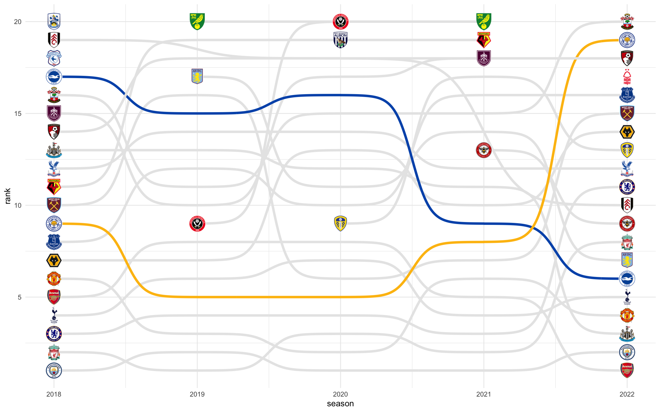
Scales & Labels
This would look better if we saw teams ranked from 1-20. The y scale is in ascending order, to adjust this to fit our needs, we’ll use scale_y_reverse() to flip it.
To make it more intuitive for people to interpret, we’ll add in text layers to label teams from the beginning season, 2018, and teams in the ending season, 2022. We won’t just add in text, we’ll make it fancy with some HTML tweaks (glue comes in handy here to create dynamic text). We can pass in basic HTML formatting with ggtext::geom_richtext.
We also want the text slightly to the left or right, here I’ve created a new variable label_padding to help us subtract or add a little bit to the x position. To make sure our labels show up on our plat, we also need to adjust our x axis with scale_x_continuous().
label_padding = .2
font_size = '14px'
font_rank_size = '16px'

plot_v2<-plot_v1+
  #add in labels on the left side
  ggtext::geom_richtext(data = image_data|>filter(season==2018),
                        hjust=1,
                        mapping=aes(y=rank, x=season-label_padding,
                                    label.size=NA, family="sans",
                                    label=glue("<span style='font-size:{font_size};'>{team_name}<span style='color:white;'>...</span><span style='font-size:{font_rank_size};'>**{rank}**</span></span>")))+
  #add in labels on the right side
  ggtext::geom_richtext(data = image_data|>filter(season==2022),
                        hjust=0,family="sans",
                        mapping=aes(y=rank, x=season+label_padding,
                                    label.size=NA,
                                    label=glue("<span style='font-size:{font_size};'><span style='font-size:{font_rank_size};'>**{rank}**</span><span style='color:white;'>...</span>{team_name}</span>")))+
  #reverse y axis for rankings
  scale_y_reverse()+
  #add breathing room in x axis to account for labels, change breaks to season years
  scale_x_continuous(limits=c(2016.5,2023.5), breaks=2018:2022)

plot_v2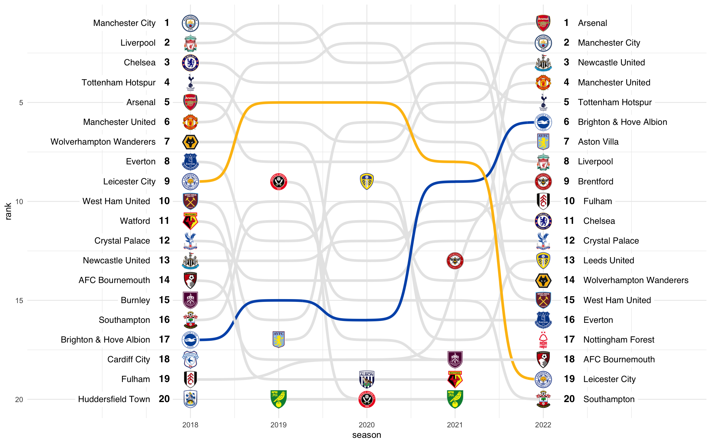
Finishing Touches
There are so many styling tricks we can apply with ggtext. We’ll use it again here to set up our title and subtitle. In our subtitle text, let’s call out Brighton & Hove Albion and Leicester City in their respective plot colors.
To make sure ggplot2 renders plot title and subtitle with ggtext, you need to adjust the theme arguments for plot.title and plot.subtitle to element_textbox_simple(). You can use this element similarly to element_text. For our visual, we’ll align title and subtitle in the center with hjust and halign.
Here’s what the final output looks like:
Note: Because we’re adding more height to our plot, I’ve also adjusted the plot height to account for title + subtitle (7.5 -> 9).
title<-"<span>**A TALE OF TWO CLUBS**</span>"
subtitle<-"<span>The English Premier League is the top professional football league in England. This chart highlights the teams with the most significant contrasts in rankings over the past 5 seasons.<span style='color:#0057B8;background:red;'>**Brighton & Hove Albion**</span>, a realtive newcomer to the league, has impressively gained 11 places and now sits at 6th place, while <span style='color:#FCBA03;'>**Leicester City**</span> has experienced a decline in performance, falling 10 spots to 19th place.</span>"


plot_v2+
  labs(title=title, subtitle=subtitle)+
  theme_minimal()+
  theme(text=element_text(family="sans"),
        plot.title = element_textbox_simple(halign=0.5, margin=margin(b=10,t=15), size=22),
        plot.subtitle = element_textbox_simple(halign=0, hjust=0.5, margin=margin(b=10),
                                               width=grid::unit(7.25, "in"),
                                               size=11, color="#424242"),
        axis.text.x=element_text(size=10, vjust=5),
        axis.ticks=element_blank(),
        axis.text.y=element_blank(),
        panel.background = element_blank(),
        panel.grid = element_blank(),
        axis.title = element_blank())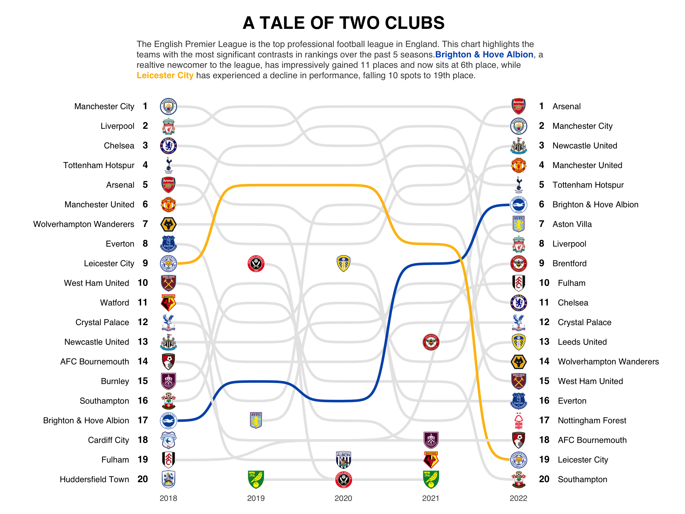
Thank you for joining my ggbump walk-thru!